
The product
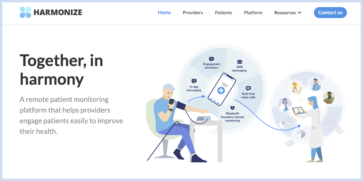
Harmonize Health is an intuitive platform that helps providers maintain the highest patient engagement. Patients can enroll and engage with their treatment protocols with a click-of-a-button.
Problem
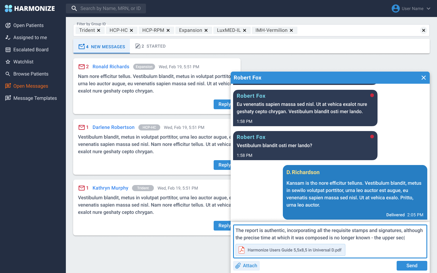
Harmonize has a web/app where health care providers interact with patients. Harmonize introduced a new feature where health care providers could interact with patients via the "Messaging center". The first version contained a chat box and past messages that were floating and overlapped each other.
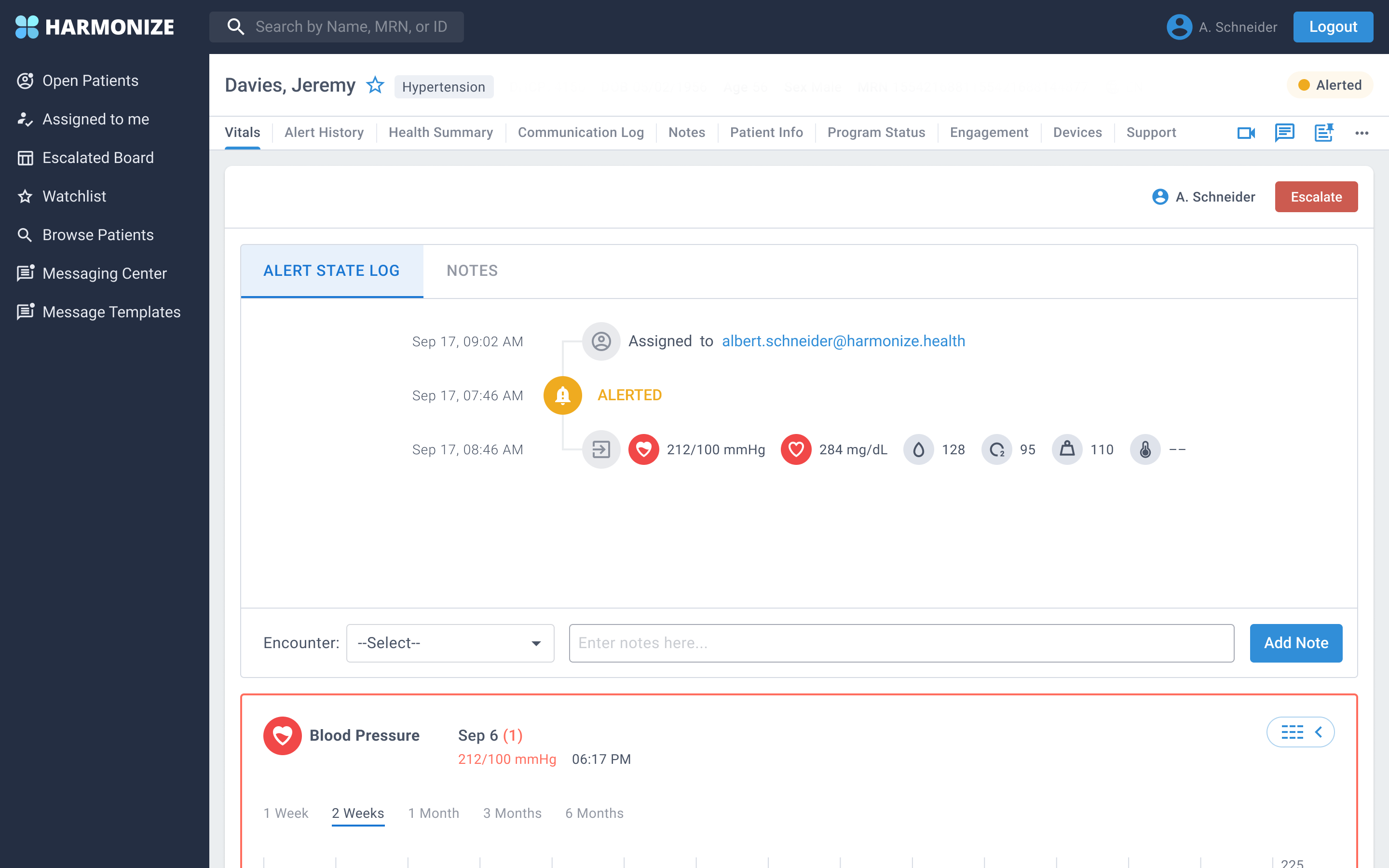
Navigating from the messaging system to the patient profile in order to gather patient information, caused a lot of confusion and health care providers where lost trying to find a way back to the chat box.
My Role and Responsibilities
In this six week long project, I worked as a UX Designer along with a Product Manager and a Senior Product Designer. My responsibilities included competitor research, user research, personas, wireframes, mock-ups and prototyping in Figma
Competitive Analysis
I researched websites such as Twilio and Birdeye in order to find what technologies were being used. The critical functionalities in these apps consisted of chat, calls and emails between users and providers.
Twilio
Twilio Flex is a cloud-based contact center that enables you to create a contact center experience with customers, agents and supervisors. The application allows users to connect via call or chat.

Birdeye
Birdeye is a all-in-one customizable experience. Birdeye provides livechat, chatbots, payments, surveys and ticketing system for small business and Enterprise companies.

Persona - Providers
Persona - Patient

Wireframes
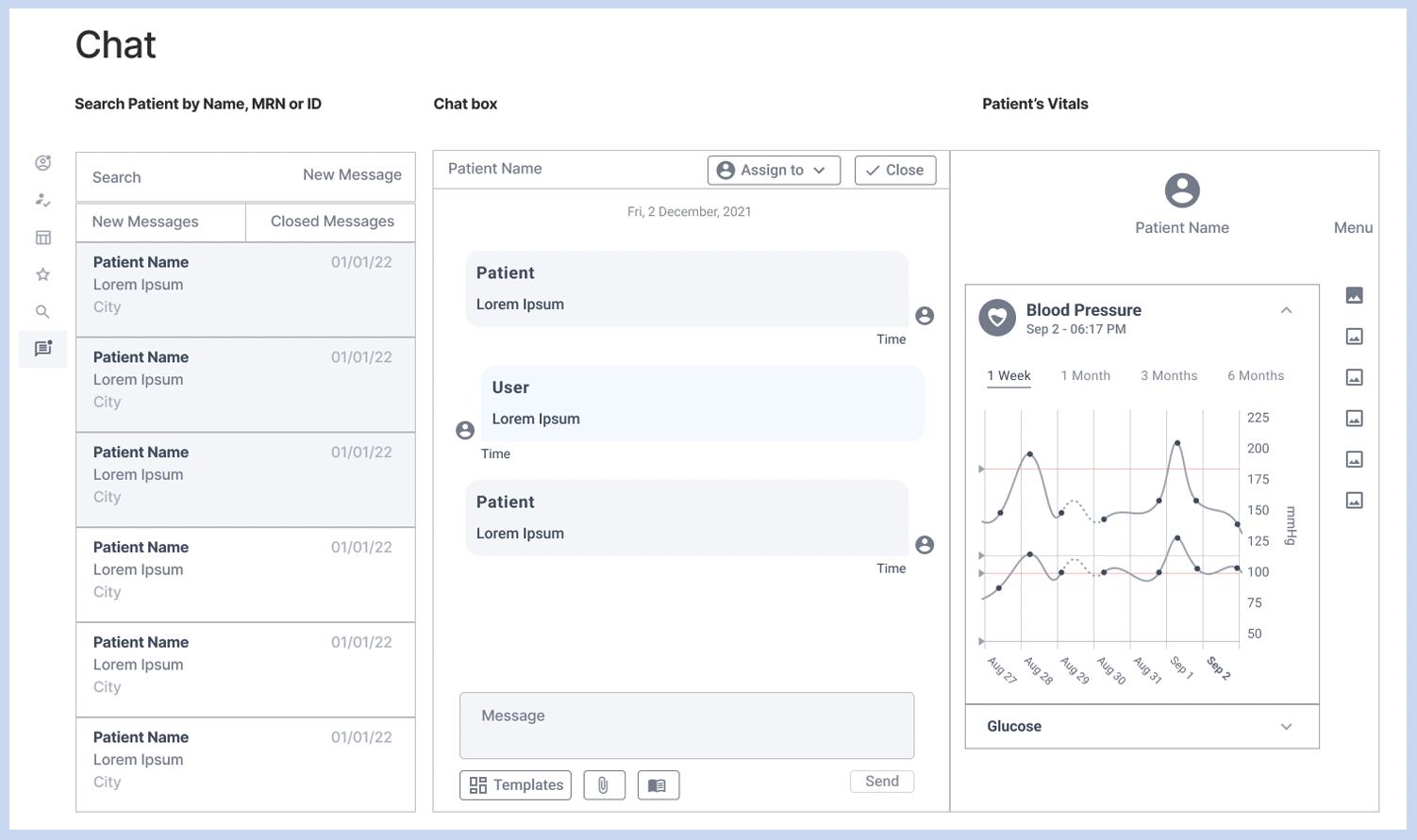
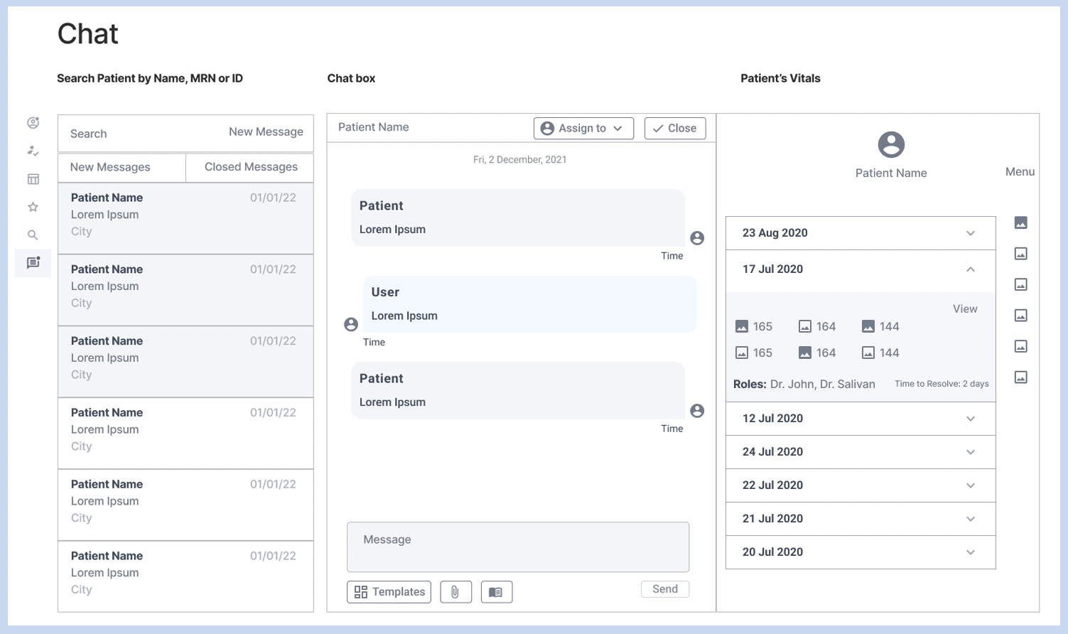
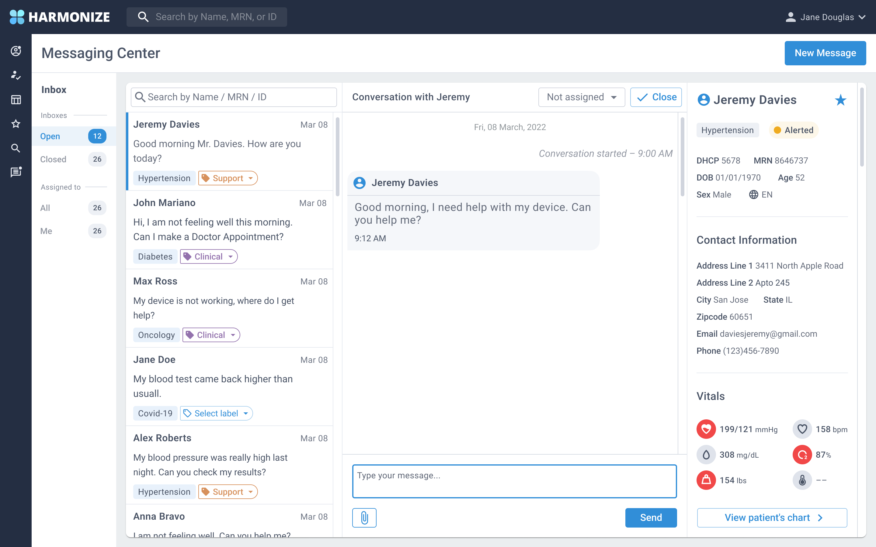
Create a three column solution where the provider can have access to the messaging inbox, chat box and the patient information. Provider should be able to view patient vitals and a summary of the patient's information.
User Testing
Usertesting.com was used to conduct the testing of the first prototype. In order to keep the company's privacy, I hid the company's logo and menus. The user testing consisted of trying several features that were added such as opening a new message, assigning a conversation to a new provider, responding a chat message and creating a new message.
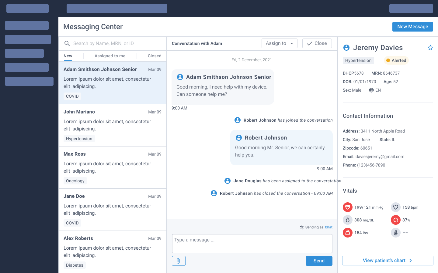
The user test results were documented in the company's IT service management tool called ClickUp. Some of the improvement suggested were also documented and applied to the final version.
Solution
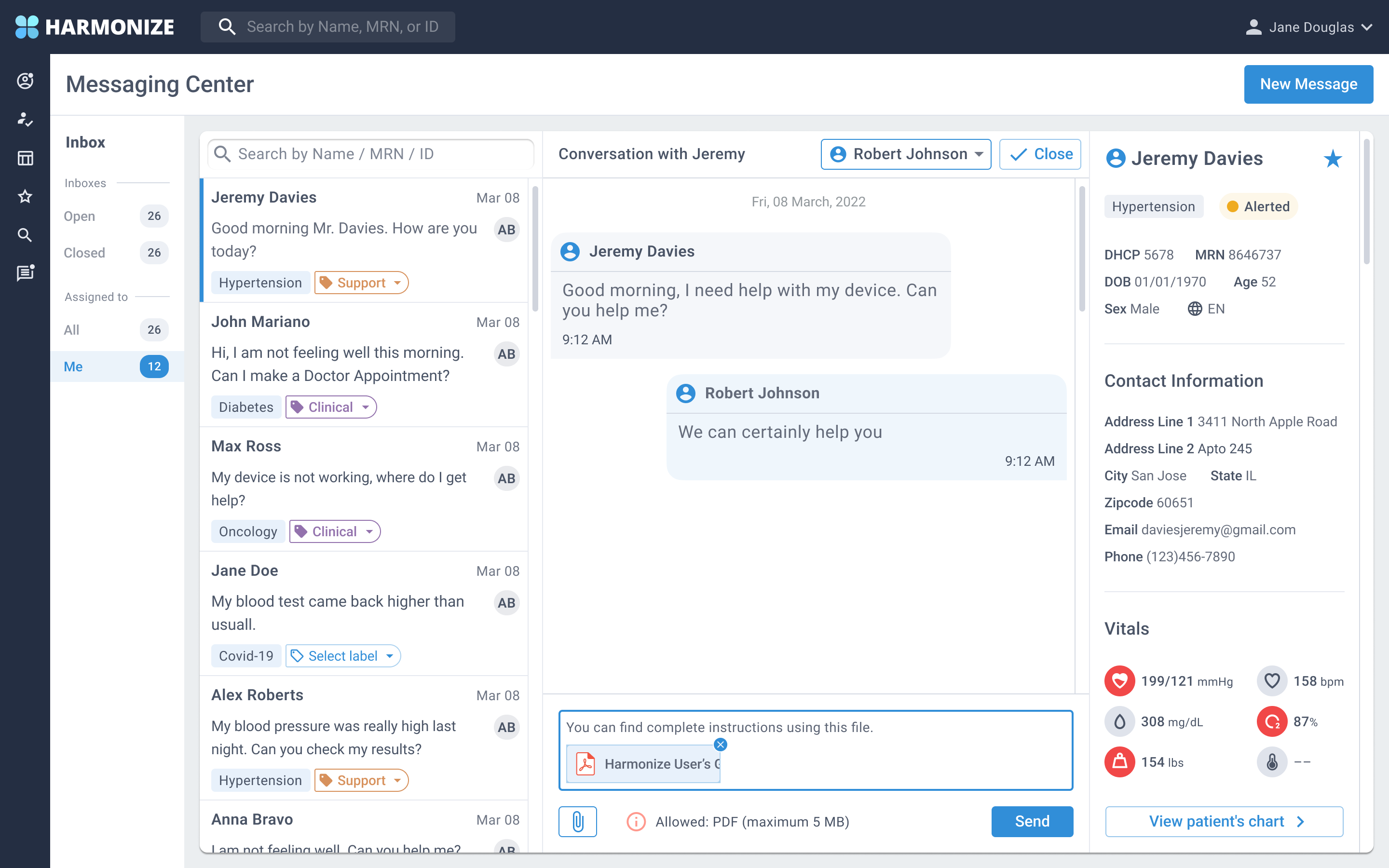
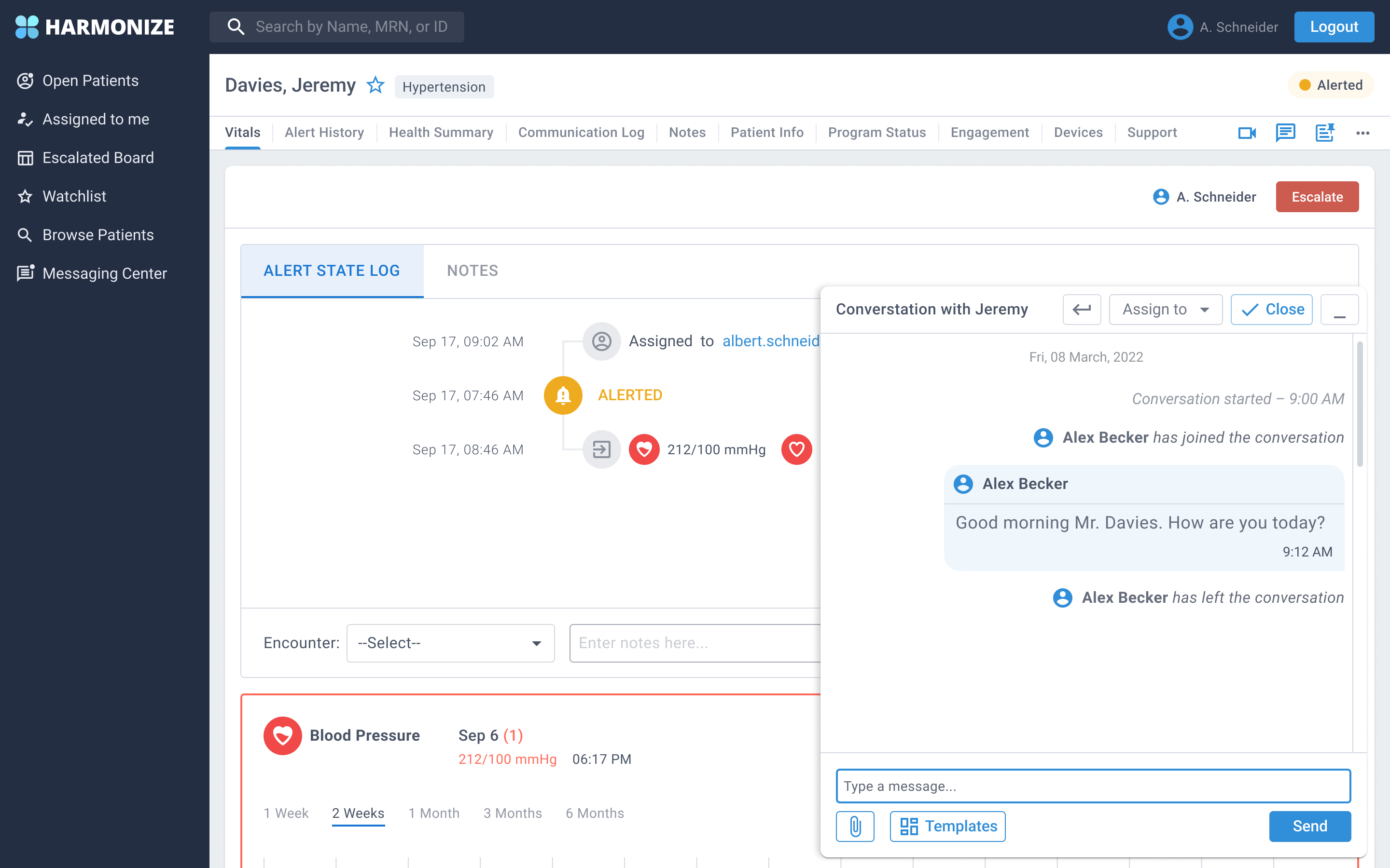
Create a new design for the messaging system where the health care provider can access an inbox, chat box and the patient profile all in one location.

Be able to view the full patient profile, gather important information and still have access to the chat without being disconnected from the chat window.

Prototype created in Figma - Providers
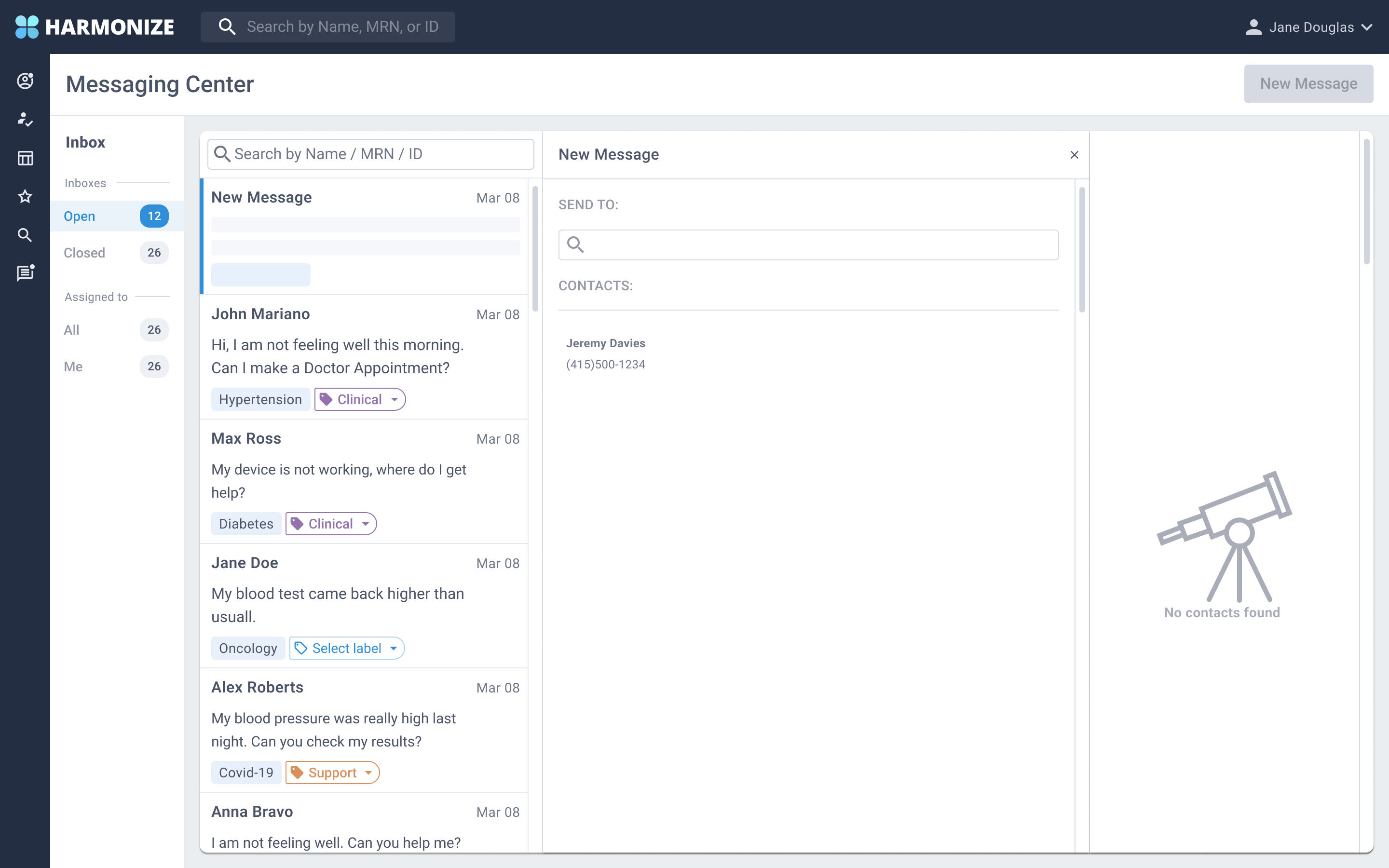
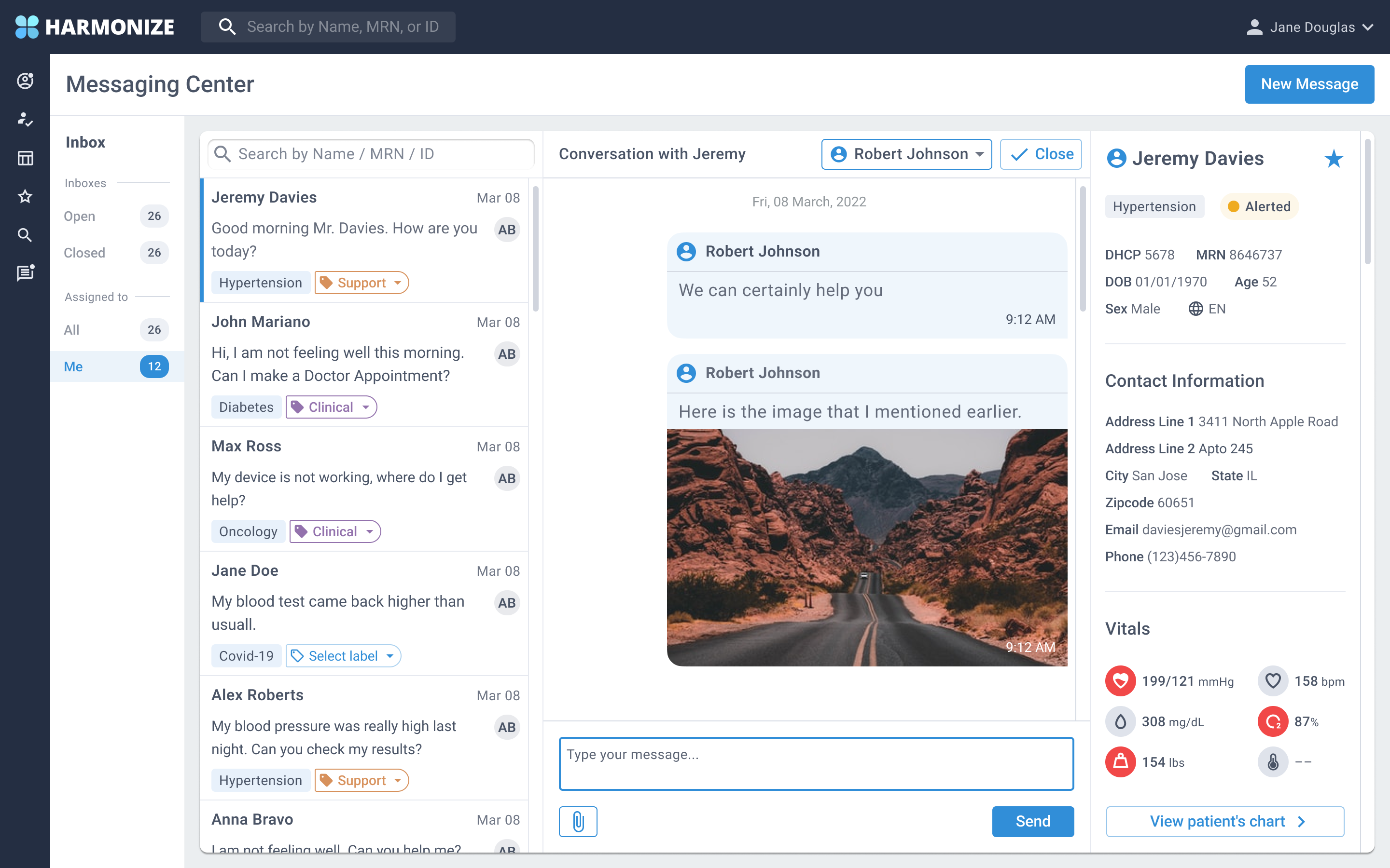
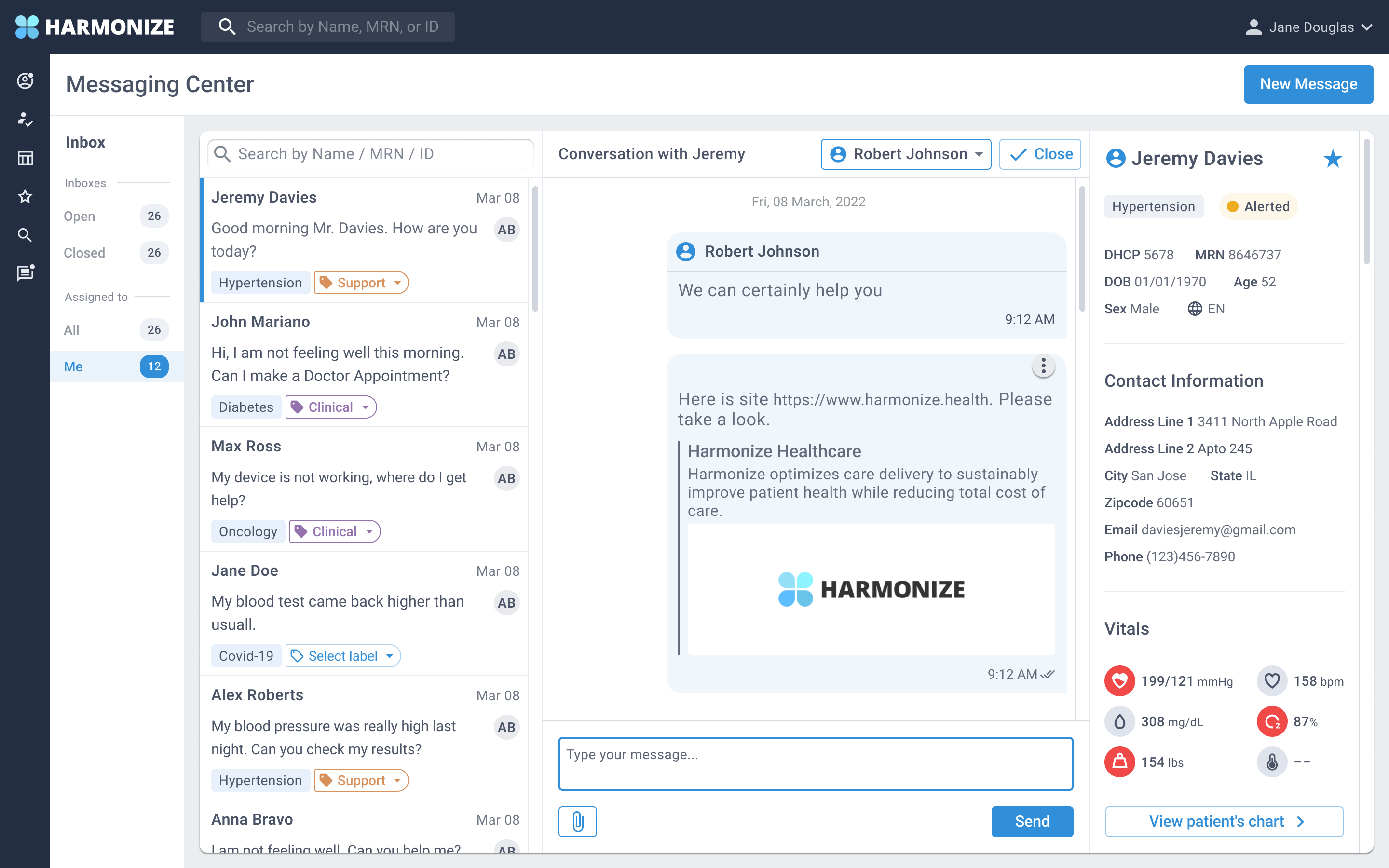
For this prototype, I created the figma prototype for providers so they are able to access the Messaging Center and be able to view the inbox, search patient, start/assign/close a conversation and view patient profile.
Takeaways - What I learned
During the six week long project, I learned a lot from my peers. They were very helpful and provided positive feedback and guidance to make this a successful project.
Next Steps
My design was handed to the developers and they created the messaging center for providers. They received positive feedback from health providers about the new interface.
